
 Facebook
 X
X
 Pinterest
 Copy Link
Behr 2026 Color of the Year: How to Style Your Home with Behr’s Hidden Gem

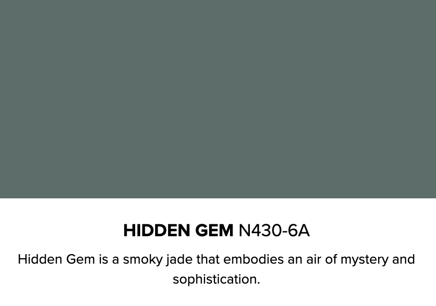
Color has a way of reshaping the way a home feels, and for 2026, Behr has introduced a shade that truly sets the tone. Hidden Gem N430-6A, a smoky jade with an air of quiet confidence, is rich, refined, and just mysterious enough to keep your rooms interesting long after the paint dries.
As homes continue shifting toward more personal, expressive spaces, this jewel-toned green blue arrives right on cue. Whether you’re updating a single room or planning a top-to-bottom refresh, here’s how to embrace Behr’s Hidden Gem and blend it seamlessly into 2026’s biggest interior design trends.
Behr Color of the Year: Hidden Gem
Each year, Behr’s color experts look to lifestyle trends, design movements, and cultural moods to select a single shade that reflects how people want to live. For 2026, the demand is clear: homeowners are craving comfort, character, and a stronger connection to the natural world. Hidden Gem brings all three into perfect balance, offering a sophisticated, versatile tone that feels intentional without overpowering a space.
With its deep teal base and soft smoky undertones, it offers a calm, eye-catching depth that shifts effortlessly with the light, perfect for layering with the color and design trends shaping homes in 2026.
Source: Behr 2026 Color of the Year – Hidden Gem
Balancing Hidden Gem with 2026 Color Trends
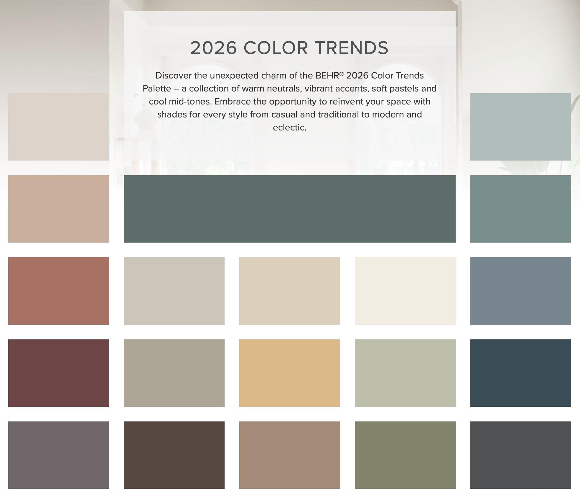
Color forecasters agree that 2026 will be defined by rich, soothing, nature-inspired hues that help homes feel more grounded and expressive. Hidden Gem fits neatly into this movement, especially as tranquil teals rise in popularity.
This year’s trend reports also point to the growing appeal of warm blacks and mellow reds. These deeper tones bring drama and intimacy into a space, particularly in small rooms or architectural moments. Hidden Gem pairs beautifully with warm blacks like Behr’s Cracked Pepper and earthy reds such as Terra Cotta Urn, creating a thoughtful contrast that feels modern and moody.
Uplifting yellows and soft neutrals will also remain strong throughout 2026. Subtle creams and warm whites help brighten teal-based palettes, while tones like Wheat Bread provide a soft foundation that allows Hidden Gem’s depth to shine. Pairing it with sunny tones like Beehive or 2025’s butter-yellow trend adds a fresh lift, keeping the look balanced and inviting.
Just like Pantone’s color stories, Behr’s 2026 palette is designed to influence cohesive, livable color combinations around its Color of the Year. And the good news? Hidden Gem is unusually flexible. If you are looking for more combinations, explore Behr’s full list of 2026 color trends for additional inspiration.
Source: Behr 2026 Color Trends
How to Align Hidden Gem with Other 2026 Home Trends
Beyond color, the home trends emerging in 2026 offer even more ways to weave Hidden Gem into a refreshed modern space.
Color Drenching and Moody Palettes
One of the biggest design shifts heading into 2026 is the rise of color drenching, where a single shade covers the walls, trim, ceiling, and sometimes even furniture in a room. The look creates a fully immersive, moody atmosphere that feels polished and cohesive. Hidden Gem is especially well-suited for this approach because of its depth and richness.
Alongside this trend, deeper, moodier palettes are also becoming more popular. Saturated hues like greens, ochres, burgundies, and tobacco-inspired tones are appearing more often in homes, reflecting a growing desire for warm color and expressive style.
Personalized Spaces and Self-Care at Home
Design is becoming more personal, and many homeowners are carving out spaces meant for calm, comfort, and everyday wellness. Cozy reading nooks, spa-inspired bathrooms, and small restorative spaces continue to rise in popularity, offering a way to slow down within the home.
Hidden Gem’s serene, smoky character makes it an ideal backdrop for these spaces. It brings a quiet sense of balance to reading nooks when paired with warm wood or soft, textured fabrics. In bathrooms, it complements natural materials and warm metals, creating the same soothing quality you’d expect from a spa.
Sustainability Remains a Priority
Sustainability continues to influence how people design and renovate their homes. From natural materials to energy-efficient upgrades and EV-friendly features, homeowners are seeking ways to make their spaces both stylish and environmentally conscious.
Hidden Gem’s nature-inspired tone fits comfortably within these choices. It pairs effortlessly with organic textures like stone, linen, clay, and reclaimed wood, creating a look that feels grounded and connected to the environment.
With Hidden Gem leading the way, 2026 offers endless opportunities to create a home that feels expressive, grounded, and beautifully your own.

Pantone 2025 Color of the Year: Infusing Mocha Mousse into Your Home
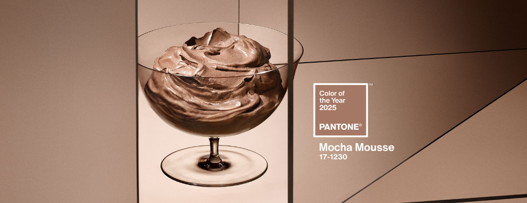
Another year, another reason to repaint. Pantone, the global authority on color, has announced its 2025 Color of the Year, “Mocha Mousse.” And as this year’s interior design trends lean towards more earthy tones, this creamy, rich brown is set to be everywhere—from your morning coffee to your neighbor’s curtains. Whether aiming to create a relaxing and warm sanctuary or add a refined accent to your home, Mocha Mousse is the perfect color to set the mood. Check out these creative and stylish ways to introduce this timeless color into your home and elevate your atmosphere.
Pantone Color of the Year: Mocha Mousse
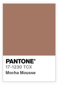
PANTONE 17-1230 Mocha Mousse is a warm, muted brown with creamy undertones inspired by the decadent qualities of chocolate mousse and coffee. Chosen for its perfect balance of richness and warmth, Pantone describes Mocha Mousse as reflecting our collective desire for comfort, indulgence, and connection. Its smooth and inviting tones combine sophistication with coziness, making it a versatile neutral color that can enhance any space.
How to Use Mocha Mousse in Your Home
Mocha Mousse follows the latest interior design trends that embrace earthy, neutral tones. From minimalist to eclectic, it pairs beautifully with various styles, materials, and color palettes, ideal for any room needing a warm hug. Whether used on accent walls, in textiles like throw pillows and drapes, or through smaller décor details, Mocha Mousse infuses spaces with elegance and a soothing ambiance.
Harmonizing Mocha Mousse with Complementary Color Pairings
Mocha Mousse isn’t just a color—it’s a mood setter, harmoniously blending with many design styles and color schemes. Pantone’s color enthusiasts created five unique palettes featuring the versatile hue, each designed to evoke a different mood. These palettes included a serene, airy combination of soft neutrals in “Relaxed Elegance,” calming, nature-inspired tones like willow green in “Floral Pathways,” and vibrant, exotic contrasts in “Uniquely Balanced.”
Using their expertly curated color stories and suggested harmonies, you can easily integrate the delicious 2025-color Mocha Mousse into your home’s existing color palette. For instance, it compliments warm tones like deep reds, pinks, or soft oranges, adding depth without overwhelming the space. If you have cooler shades like blues and greens, Mocha Mousse will balance these tones, creating a more grounded space. For a more subtle touch, you can also pair it with natural wood tones, light grays, or delicate creams to enhance its elegance. If you want to explore more color options that fit your style, check out these 11 Ways to Uncover Your Personal Color Palette.
Using Mocha Mousse with Interior Design Trends of 2025
Earthy, neutral tones are here to stay in 2025, and Mocha Mousse is leading the charge with its grounding, warm appeal. With brown furniture also remaining a strong trend, this hue can complement rich wood and leather pieces, adding comfort and sophistication. It beautifully blends with natural materials like stone, wood, and ceramics, enhancing modern, rustic, and bohemian interiors, along with many others. Similarly, Mocha Mousse pairs well with metals and verdigris, which have become increasingly popular.
Mocha Mousse naturally complements the curvier lines, soft shapes, and rounded furniture pieces that are defining 2025. It can be easily into spaces with arched doorways and rounded furniture to create a polished, inviting environment. You can also embrace it with the comeback of wallpaper, upholstered walls, and drapery, whether in subtle patterns or rich textures like suede and velvet, bringing more dimension to the room.
With Mocha Mousse as your foundation, you’ll effortlessly embrace this year’s design trends, creating a space that is timeless, warm, and sophisticated.
Pantone 2023 Color of the Year: How to Use Viva Magenta in Your Home
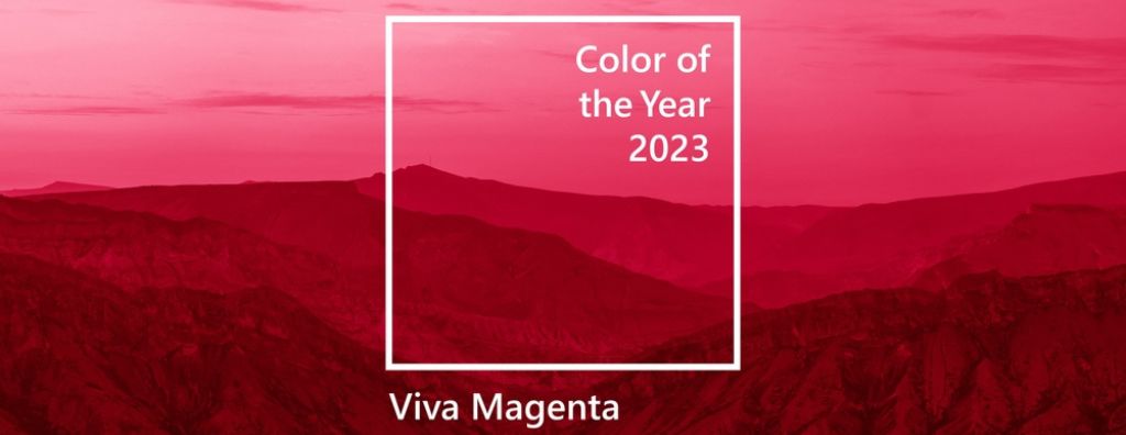
Another year, another statement from the Pantone Color Institute, the leading authority on all things color design. The global color expert recently announced their Color of the Year for 2023: Viva Magenta. A beautiful hue of the red family, it is vibrant and soothing at the same time. Just like last year’s selection, Very Peri, it captures common feelings shared by modern homeowners while presenting a bounty of creative design solutions. Learn a bit more about this special color and how you can incorporate it into your home.
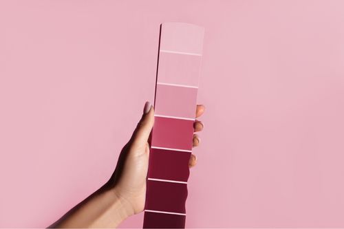
Image Source: Getty Images – Image Credit: YakubovAlim
Pantone Color of the Year 2023: Viva Magenta
Viva Magenta is a bright, crimson red that balances warm and cool energy. Pantone describes the color dynamically, calling it “fierce” and “rich.” They say it differs from last year’s selection in that Viva Magenta answers our “collective need for strength.” So, what does this mean for you as a homeowner? Viva Magenta is a color of unity. It has the power to embrace and make your guests feel welcomed while maintaining a modern aesthetic. Colors in the red family are known to make a home feel comfortable, especially in the dining room. It has often been said that reds can stimulate appetite.
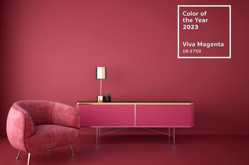
Image Source: Shutterstock – Image Credit: Ume Illustration
How to Use Viva Magenta in Your Home
This year’s interior design trends are showing a preference for colorful decorating. Viva Magenta fits this mold perfectly. It is a bold and vivacious choice for interior paint. Need a splash of energy in the living room? Looking to give your dining room a makeover? Viva Magenta may be the perfect solution.
In terms of complementary colors, Pantone specifically calls out pale grays, blues, and pastels. This shade of magenta can be a stunning accent color for homeowners that prefer a more neutral backdrop while incorporating elements of contemporary home design. The typical accent pieces come to mind: pillows, blankets, and throw rugs. However, Viva Magenta is also perfectly suited for accent items in the kitchen—think glassware, candle holders, hand towels, etc. For those who are ready to dive into the deep end of the magenta pool, consider a velvet couch. Its boldness also goes well with interior design styles that are characterized by flair, such as Art Deco interior design.
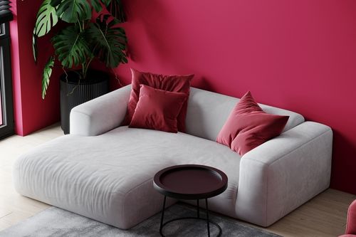
Image Source: Shutterstock – Image Credit: Viktoria Lytvyn
Viva Magenta is sure to lead the eye throughout your home. Its magnetic energy may be the missing ingredient to your interior design plans for 2023. For more information on color design tips, read our blog post on Colorful Modern Design Trends for Your Home.
Featured Image Source: Shutterstock – Image Credit: sommthink
Five Ways to Incorporate Pantone’s ‘Living Coral’ Into Your Home
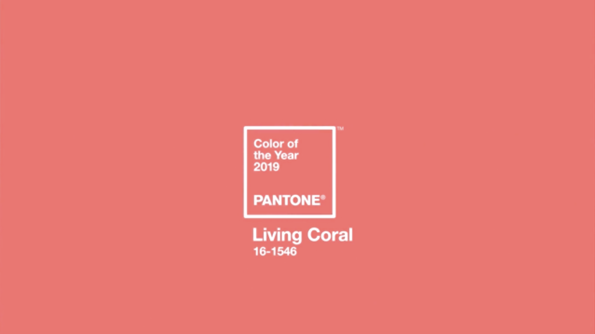
Design inspiration comes in many forms, but few carry the cache of the Pantone Color of the Year. For two decades, the Pantone Color Institute has convened to debate and determine an appropriate color that represents the current times. In a tradition harkening to the pageantry and mystique of secret societies, biannual meetings are held in private by color and design experts to determine…
6 Ways to Incorporate the Color of the Year in Your Home
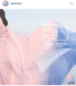
The Pantone Color of the Year was announced a couple of months ago and we can’t express how awesome these colors are apart, let alone together. For the first time Pantone introduces two shades as the Color of the Year 2016: Rose Quartz and Serenity are a fusion of warm and cool; promoting not only a non-traditional color match, but also gender equality. Here are six different ways to integrate…
")


