
 Facebook
 X
X
 Pinterest
 Copy Link
This video is the latest in our Monday with Matthew series with Windermere Chief Economist Matthew Gardner. Each month, he analyzes the most up-to-date U.S. housing data to keep you well-informed about what’s going on in the real estate market.
Hello there. I am Windermere Real Estates Chief Economist, Matthew Gardner, and welcome to the March episode of Mondays with Matthew.
Well, we have lots to talk about this month so let’s get straight to it and, first off, let’s take a look at the February existing home sales numbers.
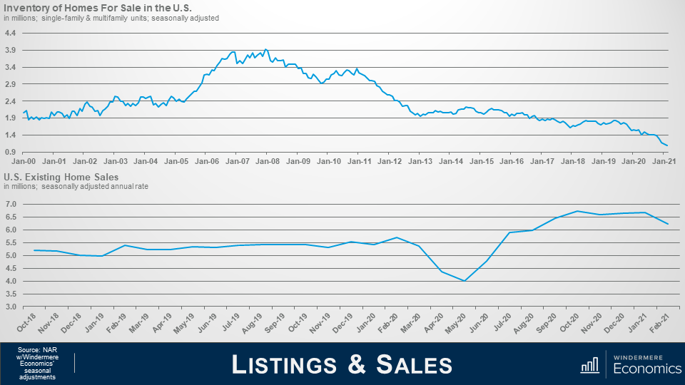
Listings and Sales. Source: NAR with Windermere Economics Seasonal Adjustments
As you can see in the top chart, the number of homes for sale was measured at just over 1 million units. This is a woefully low number and one that we haven’t seen since NAR started to gather data on listing inventory.
And the bottom chart shows home sales and they fell by 6.6% month-over-month in February to a seasonally adjusted annual rate of 6.22 million units but they were still 9.1% higher than a year ago.
Why the drop? Well, I am putting the blame squarely on the shoulders of home sellers who – quite frankly – simply aren’t selling!
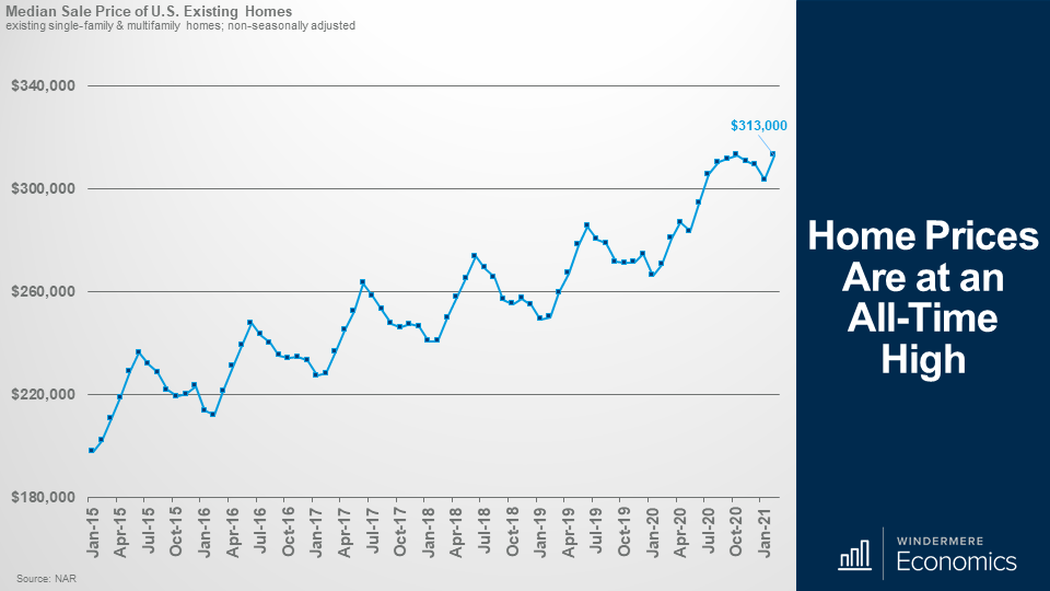
Home Prices are at an All-Time High
And looking at sale prices, they ticked higher in February to a median of $313,000, and that matches the all-time high seen last October and is 15.8% higher than we saw a year ago. This is the fastest annual pace of price growth seen since August of 2005, but I have to add that the number is a little deceiving as it was skewed higher by significant growth at the upper end of the market with sales above $750,000 accounting for close to 10% of all sales in February and sales above $1M up by a whopping 81% when compared to a year ago.
The numbers also showed that homes took an average of just 20 days to turn pending, another record, and 74% of homes sold in less than one month.
Individual investors or second-home buyers purchased 17% of all homes sold in February, and that’s up from 15% in January and matches the share seen a year ago
Now, as we move through the year, there are a couple of things worth noting.
We all know that the market is tight, but I still expect total sales this year to come in at around 6.3 million units – this is lower than my forecast from the start of the year but would still represent an 11.6% increase over 2020.
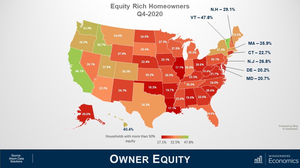
Owner Equity.
Although these are not numbers from NAR, I did want to share with you some different data that does relate directly to the increase in sale prices that we have just discussed.
With the significant upswing in sale prices that we have seen over the past 8 or so years, over 30% of all homeowners in America currently have more than 50% equity in their homes and this is a massive figure.
But across the country, there are significant variances as you can see here.
The largest share of homeowners who are equity rich live in Vermont and California but many west coast markets are not far behind with significant owner equity seen in WA, OR, ID, UT, & CO.
These really are very impressive numbers.
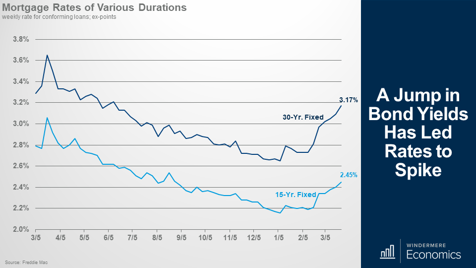
A Jump In Bond Yields Has Led to Rates to Spike
It’s time to take a look at mortgage rates as a lot has been going on in that space too since we last talked.
This chart shows the average weekly rate for 15 and 30-year conforming mortgages and, as you can see, rates started to jump in early February and I find it very unlikely that they will drop back down at any time soon.
I am sorry, folks, but the days of 30-year rates starting with a 2 handle well they are now firmly in the rearview mirror.
So what has caused this spike?
Well, it’s very simple. COVID-19 case counts are dropping; the distribution of a vaccine is going remarkably well. As I speak, over 130 million doses have been given and over 46.4 million people are now fully vaccinated against COVID-19.
But there is a fear that that – with the country starting to reopen – we will see a significant boost in economic activity which, in concert with the latest round of stimulus payments, has generated rumblings from some economists who are now looking to see inflation to take off.
And as much as its great news that we are seeing a better than expected rollout of the vaccine, which will lead to faster economic growth in the second half of the year, the potential for inflation to rise is now elevated and this has caused a move out of bonds – specifically 10-year treasuries, which means that the interest rate for these bonds has to rise and the interest rate on 10-year paper directly impacts mortgage rates – specifically the rate on the ever-popular 30-year mortgage.
But before everyone starts getting panicked about this, look at it this way.
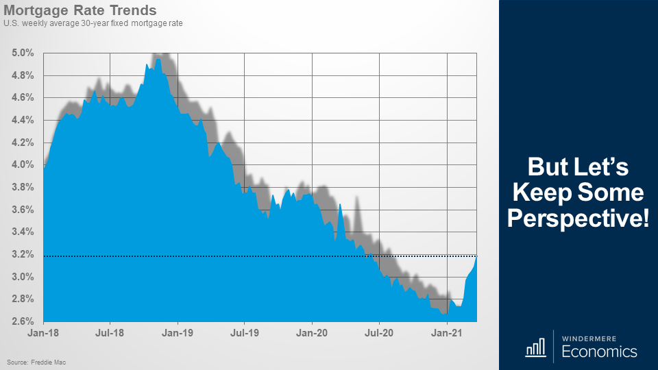
But Let’s Keep Some Perspective!
Even at 3.17%, rates remain remarkably low. Yes, the current rate was last seen in June of 2020, but it is still well below the long-term average.
But, that said, and given the upward move in Treasury yields, I have had to rerun my forecast models for mortgage rates, and here is where I see rates trending this year.
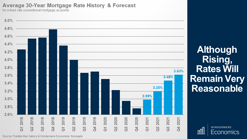
Although rising, rates will remain very reasonable
I expect that we will see rates rise to an average of 3.6% by the 4th quarter of 2021 and, looking farther out, we will likely break back above 4% in early to mid-2022.
Now, I could actually be a little optimistic if – and it’s a big if – 10-year bond yields rise faster than I am forecasting but, for now, I don’t see that happening unless, of course, inflation really does take off but, again, I don’t see that.
That said, I am looking for a spike in inflation in the next few months as we feel more comfortable going out again and we start to spend our money in a more normal manner, but I believe that inflation will level off and not get out of control. However, if it does, then more bond buyers will head further out along the yield curve and buy longer duration treasuries to counter inflation, which will mean that the interest rates on 10-year treasuries will have to rise to attract buyers and this, of course, will lead mortgage rates higher.
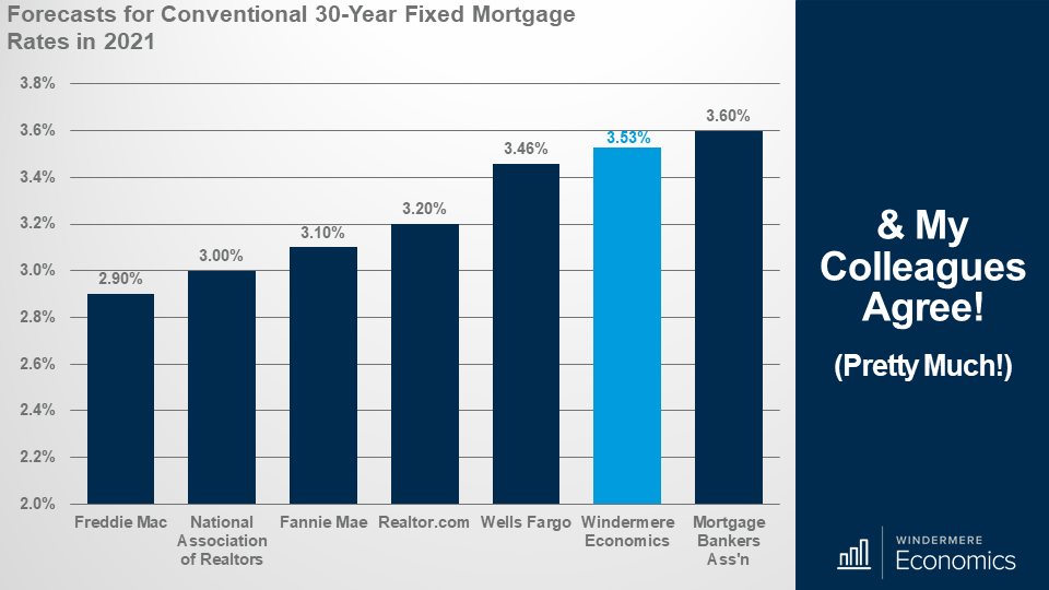
And my colleagues agree!
And just in case you don’t believe me, here is my forecast for the average rate in 2021 rates alongside some of my fellow economists, and, as you can see, other than Freddie Mac, we are in a fairly tight range.
I would add that the NAR and Freddie forecasts are a month or so old, so I would not be surprised to see them revise their forecast upward at some point.
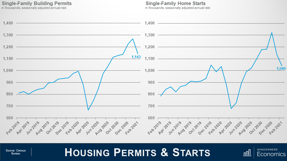
Housing Permits & Starts
Moving on to the new home market – both permits and starts pulled back in February with starts down by 8.5% on the month and single-family permits down by 10%.
So, what was going on? Well, despite strength in buyer traffic and lack of existing inventory, builders are slowing some production of single-family homes as lumber and other material costs continue to rise.
And shortages of lumber and other building materials, including appliances, are also putting future construction at risk.
While single-family starts for the first two months of the year are 6.4% higher than the first two months of 2020, there has been a 36% year-over-year increase in single-family homes permitted but not yet started as some projects have been put on pause because of the cost and availability of materials to build homes.
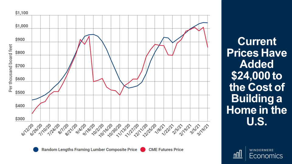
Current prices have added $24,000 to the cost of building a home in the U.S.
And to give you some perspective about the direction of lumber prices, they have skyrocketed more than 180% since last spring and this price spike has caused the price of an average new single-family home to increase by more than $24,000 since April of last year.
This chart provides an overview of the U.S. framing lumber pricing market and it’s not pretty.
But you can also see that the futures price has been dropping which may mean that we are getting closer to the end of the massive increases in lumber prices that builders have been facing. Time will tell.
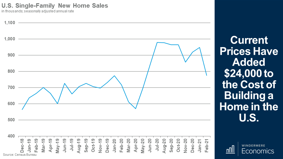
U.S. Single-Family New Home Sales in thousands, seasonally adjusted annual rate.
And on the sales side of the equation, after a slight rebound in December and January, the slowing of the pace of new home sales continued in February as a combination of affordability challenges, more costly materials, and storm effects which, in concert with each other led purchases of new homes to drop by 18% to a seasonally adjusted annual rate of 775,000 units.
But I would add that the February sales rate was 8% higher than we saw a year ago, and there is still demand which is being supported by still relatively low-interest rates, but more from solid demand in lower-density markets like the suburbs and exurbs.
Inventory levels did rise slightly with 312,000 new homes for sale, but that was 4.6% lower than a year ago.
The median sales price came in at $349,400, up 5.3% from a year ago.
And finally, I recently read a fascinating analysis that the NAHB put out which in essence, suggested that the recent rise in mortgage interest rates over the past two months has priced more than 1.3 million households out of the market for a median-priced new home.
In fact, the study found that just a $1,000 increase in the U.S. median new home price would push 153,967 households out of the market.
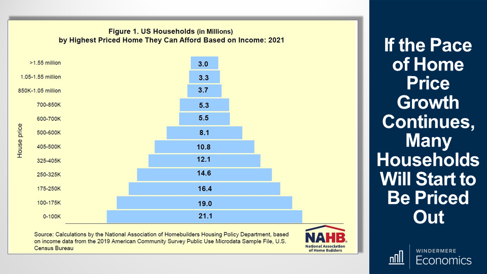
If the Pace of Home Price Growth Continues, Many Households Will Start to Be Priced Out
So, looking at it this way, the NAHB created the affordability pyramid you see here which shows that as the price of a new home increases, the number of households in each tier that are able to afford it decreases. All very logical.
About 21.1 million households are estimated to have the income needed to buy homes priced below $100,000 and they are shown on the bottom step of the pyramid.
And of the remaining 101.8 million households who can afford a home priced at $100,000, 19 million can only afford to pay a top price of somewhere between $100,000 and $175,000 and they are shown on the next step and, naturally, this trend continues up the pyramid of house prices with each step representing a maximum affordable price range and the number of households who qualify.
Although it’s certainly possible to find households at the high end of the market, there are a lot more households at the low end where affordability is a very major concern – 71.1 million households in America could not afford to buy a median-priced new home. That’s almost 58% of all households in the country.
The bottom line is that increased development costs can, and likely will, price these households out of the market for a new home, and with the cost of existing homes also rising rapidly, for more and more households, reaching the American dream of homeownership is getting harder and harder.
I am sorry – I really didn’t mean to end on a low note – but the facts are the facts. We need more housing supply and we need home price growth to slow. Of course, price growth will slow if my mortgage rate forecasts are accurate but it might already be too late of many who would like to buy a home.
So, there you have it. My take on the January housing-related data releases.
As always, if you have any questions or comments about the numbers we have looked at today, feel free to reach out. I would love to hear from you.
In the meantime, thank you for watching, stay safe out there, and I look forward to visiting with you again, next month.
Bye now.
")


