
 Facebook
 X
X
 Pinterest
 Copy Link

Hello there and welcome to February’s edition of Mondays with Matthew.
Well, there were a lot of housing-related data releases in the month that are worthy of discussion so let’s get straight to it. I am going to start out with the latest homeownership data that was just released by the Census Bureau.
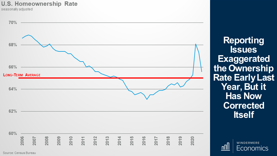
Those of you who regularly watch my videos may remember that last year I suggested that the data may have been a little bit suspect – specifically when it came to the second and third quarter ownership rates.
Anyway, for those that didn’t see me address this, or if you have forgotten, I had a concern about the significant spike in the ownership rate that you can see here, and I suggested that it might be suspect because of the way the data was gathered during the early days of COVID. You see, the survey was done via telephone and not in person – as it usually is – because of COVID-19 restrictions and I believe that this actually led to an over-reporting of the real ownership rate.
Following the massive spike we saw in the second quarter, it appears that they have found a way to more accurately gather the data and the rate has now pulled back to a level that, at least for me, passes my “sniff test”! However, even though the share of US households who own their homes did drop, it still remains above the long-term average and stands at a level we haven’t seen since 2012.
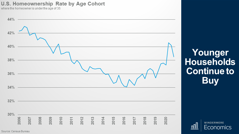
Younger Households Continue to Buy
And when we drill down into the data and look at the ownership rate for Millennials – I know, I harp on about them a lot – but you can clearly see that they really are becoming homeowners in increasing numbers and the current rate of 38.5% is a share not seen since 2011 and I expect to see this number grow over the next several years.
Demographics are driving them into homeownership as they are all getting older, many now starting families and they want to own a home. I would also add that I would not be surprised to see them shift toward ownership at even faster rates if they are allowed to work from home which may lead more of them to leave expensive cities and move to markets where it’s more affordable to buy.

And to give you a different perspective on these younger buyers, last week the New York Fed released their report on household debt that included numbers regarding the share of mortgage borrowing by age. Well, you can see in the above graph, that younger buyers continue to account for a major share of total mortgage borrowing and are borrowing pretty substantial amounts too.
In fact, in 2020 Millennial and Gen Z households borrowed over $1.3 trillion to buy homes and that’s over 35% of total new mortgage debt on a dollar basis. Although I think it’s great to see younger households grow as homeowners and the overall homeownership rate rising, all is not as I would like to see it – especially when we break down the homeownership rate by ethnicity.
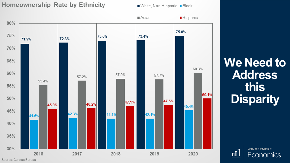
And the above report, again from the Census Bureau, showed that although the share of white households who own their homes ticked up it also showed some significant disparities with the ownership rate for black households – although up a little – still well below the levels seen with other ethnicities.
This is a long-term, and systemic issue, that needs to be addressed.
The bottom line is that the ownership rate for Black families was 25 percentage points lower than that for white families in 2020 and was even higher in the 4th quarter of the year when it almost hit 30%.
I am pleased that the Biden administration does have plans to try to address this inequality by looking to expand the ability of the Federal Housing Authority to provide mortgages and this might, if it gets approved, start to address this very significant issue. Of course, nothing will be fixed immediately, but it is a major concern and sincerely hope that, over time, this discrepancy will be addressed.
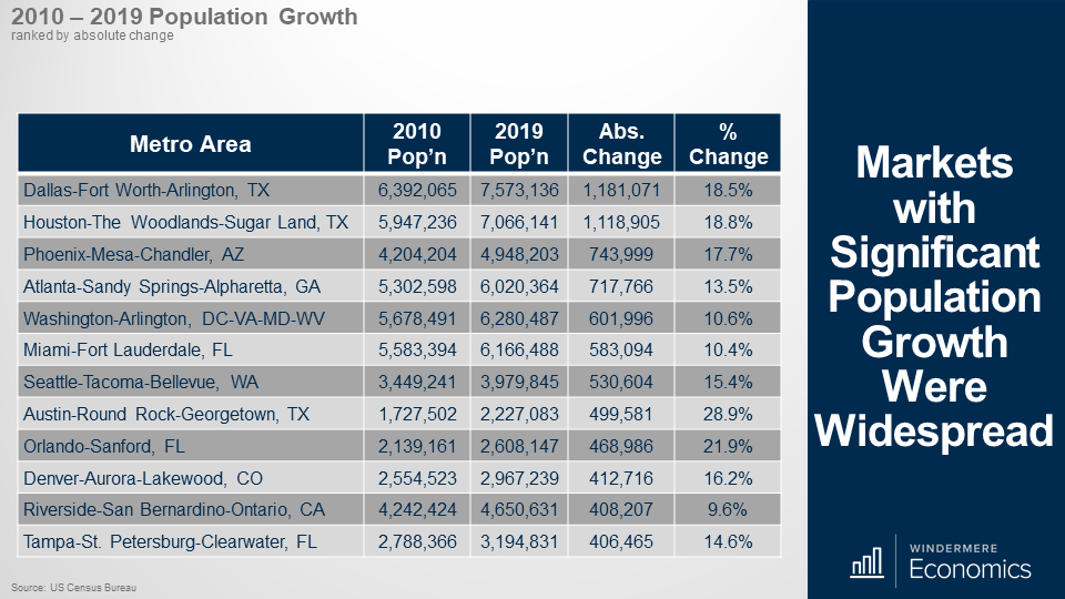
We had a very significant data drop – again from the Census Bureau – who provided their population estimates for 2019. The data may be old, but it is interesting all the same. This table shows the markets with the greatest increase in population between 2010 and 2019.
I will be honest with you that I was not surprised to see Texas lead the way, but it was interesting to see the greater Seattle region, Denver, and Riverside, California all make it close to the top of the list.
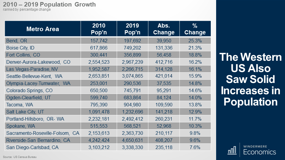
And because a couple of markets that were close to the top of the list are of interest to Windermere (as we have offices in these areas) I thought that it would be interesting to look at how some of the other markets where we have a presence are doing and the numbers are equally as impressive.
Of course, markets are of different sizes, so to balance this out, the data here shows growth in percentage terms and the numbers are again very impressive.
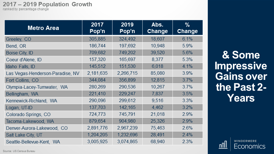
And when I focused on 2-year growth, well it’s again very impressive with significant increases seen in Colorado, several Idaho markets, Las Vegas, Western Washington, and Utah.
And I would also add that Greeley was number one here, but also ranked 4th nationally. Bend came in 7th, Boise 9th, and Coeur d’Alene 10th. Yes, I know that this data is old – it’s an issue I fight with every day – but I still see it as being meaningful.
Of course, I will be very interested to see the 2020 numbers as they will give us an indication as to how COVID-19 really is impacting where we choose to live, but we will have to wait for that!
I did read a very interesting report that was recently published by North American Moving Services where they looked at where households who moved between states moved to last year. Of course, it is not a perfect analysis, but it does give us an idea as to not just where people moved to, but where they moved from, in 2020.
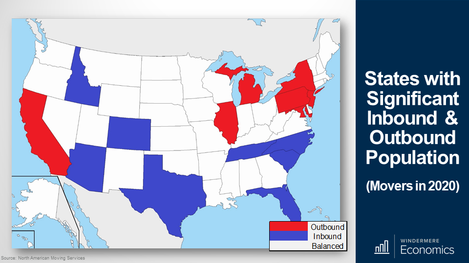
Unsurprisingly, the largest out-migration states included California – where people were mainly moving to Texas and Idaho – but there was also significant out-migration from Illinois, New York, and New Jersey.
As far as where most people migrated to, in addition to Idaho, movers were also attracted to Arizona, Colorado, Tennessee, and North and South Carolina.
Interestingly, Northeastern states make up four out of the seven states with the most outbound moves, and none of them make the top eight for inbound moves. Number one was New York which saw significant out-migration. Number 2 was New Jersey and Maryland was just beaten into 4th place by California.
But as far as the western US is concerned, – other than California – people are consistently moving in, and not out.
Also supported by the census numbers we just discussed, the number of households relocating to Idaho has been significant for the past five years and I would add that Colorado has also been in the top-10, or very close to it for the past five years.

Last week we saw the latest data on building permits and starts and although there was a softening in the number of starts in January, permit activity continues to grow significantly with single-family permits up by a massive 3.8% month over month, and 30% higher than seen a year ago. This is good news!
As far as the weakness of starts is concerned, this was primarily due to some builders who remain worried about increasing lumber and other construction material costs, as well as concerns over delays in obtaining building materials because of COVID-19 supply chain issues.
I would add that although single-family starts did drop, the number of homes under construction continued to trend higher. And for those of you who might be wondering how new starts can drop but the number of homes being built can increase, it’s purely terminology. You see, a housing “start” is where a foundation has been poured, but it doesn’t mean that vertical construction has started.
In fact, the number of homes under construction in January was up by 1.1% on the month and is over 16% higher than seen a year ago.
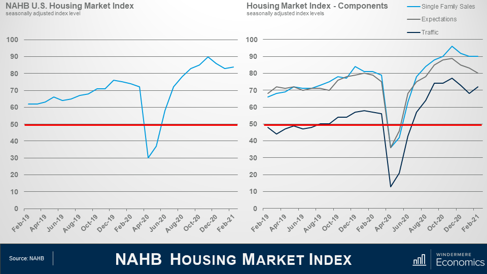
Last week we also got the February take on builder confidence and it was interesting to see it ticking back up as strong buyer demand helped to offset the supply chain challenges and surging lumber prices.
On the right, you will see the three components of the index which showed the gauge of current sales conditions holding steady at 90, while the component measuring sales expectations in the next six months fell three points to 80 but the gauge charting traffic of prospective buyers rising by four points to 72.
Although all are off their peak that was seen last fall, all are above 50 meaning that more builders find the market favorable than not.
So, this was a pretty mixed bag, but the Market Index numbers are more current than the permit and starts report so I will be interested to see what the February housing starts looks like – it wouldn’t surprise me to see a slight uptick in the number.
And finally, the January US housing sales numbers were released by the National Association of Realtors and, well, they were – again – record breaking!
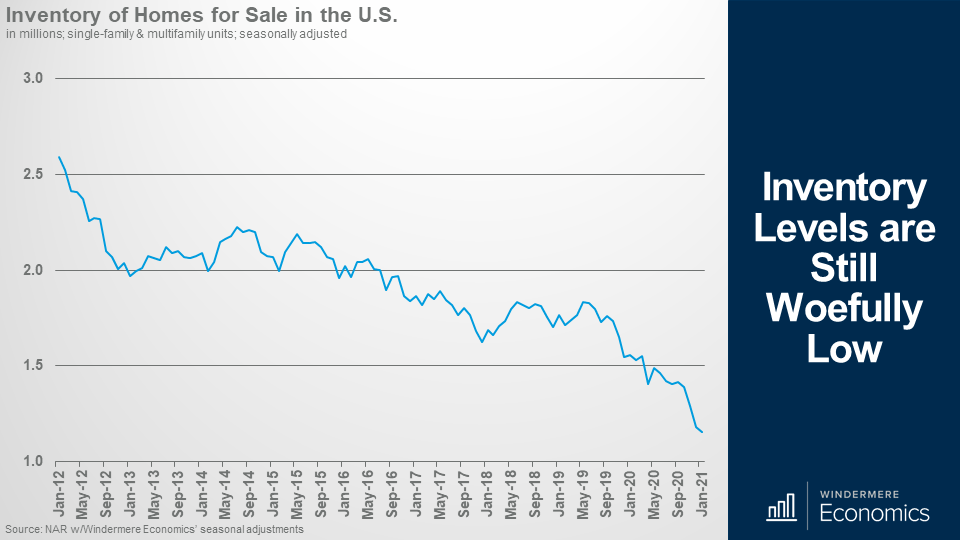
Inventory levels are still woefully low.
On the supply side, any hopes that we might have seen the number of listings rise in January were dashed with total inventory coming in at a measly 1.04 million homes for sale – that’s down 25.7% year-over-year and a new record low in absolute terms, but also a record percentage drop between January of 2020 and January of 2021.
Breaking it down, the number of single-family homes on the market remained static at 880,000 units, but the number of condominium listings dropped a little to 164,000 listings – that’s down from 179,000 in December.
Given the very low number of listings – and sales still very robust – there was just 1.9-months of supply – matching the all-time low we saw in December.
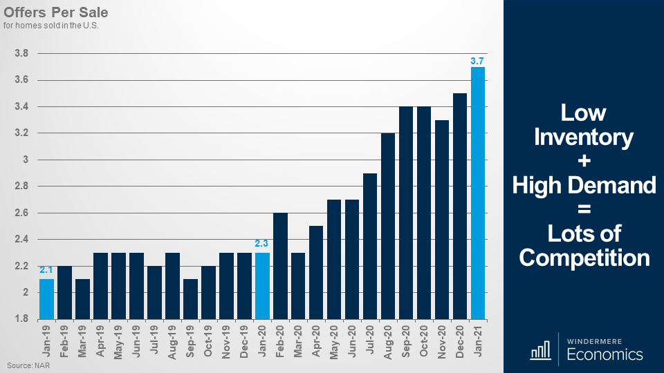
I always find this data set fascinating – and another record has been broken. For every sale that was agreed in January there were an average of 3.7 offers! That’s a massive increase from the old record of 3.5 set just the month before.
But even with record-low inventory, the number of sales remains very impressive.
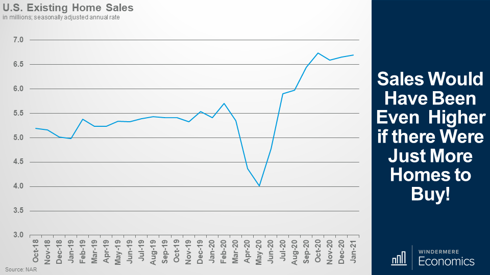
Sales would have been even higher if there were just more homes to buy!
Total sales of single-family and multifamily units came in at an annual rate of 6.69 million units in January. That is 0.6% higher than seen in December, and up by a massive 23.7% from a year ago. Sales of single-family homes rose by 23% to an annual rate of 5.93 million units while sales of condos rose by 28.8% to an annual rate of 760,000 units.
Now, some of you may be wondering how this can be? How can sales rise when there are so few homes for sale? And that is a very reasonable question.
You see, the number of homes for sale is the total available on the last day of the month, but sales can still increase because if a home is listed for sale and goes under contract in the same month, well it isn’t included in the inventory numbers for that month.
And in January, properties averaged just 21 days on the market with 71% of them selling within the month.
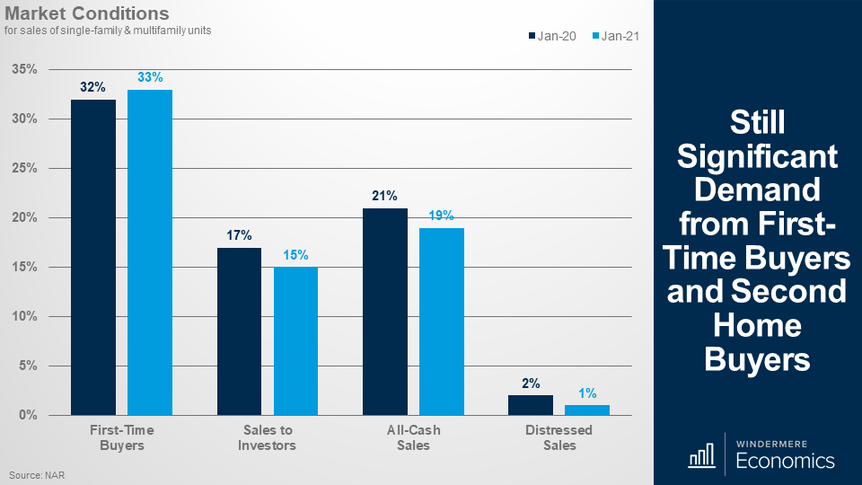
Still significant demand from first-time buyers and second home buyers.
And when we look at the details it was pleasing to see the share of homes that sold to first-time buyers up a little. Sales to investors – and these numbers include many second-home buyers – pulled back a little, but again, not a concern.
And finally, no surprises here – with many homes in forbearance, the share of distressed sales was just 1 percent.
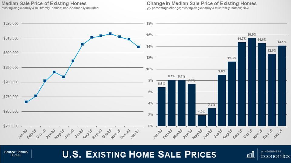
The median sale price in January was $303,900 and that’s up by 14.1% year-over-year. Now, before you get worried about the fact that it appears that prices have plateaued, it’s actually not surprising as it’s mainly a function of seasonality, as well as the limited choice of homes to buy.
Sales of homes in the US priced below $100,000 were down 28% year over year, while sales of homes priced between $500,000 and $750,000 were up 53% year over year, and sales of million-dollar-plus homes were up by 76.7% from a year ago. Geographically, price growth was most robust in the west where they were up by 16.1% year over year. Also, $1 million-plus sales accounted for over 11% of all sales in the western US too.
As I worked through the January numbers, it remains very clear to me that housing remains a shining light as we move through this pandemic period, and I expect this to continue with 2021 being another very good year for the housing market, and home sales rising even more as a vaccine gets more broadly distributed and we reopen more of the country.
So, there you have it. My take on the January housing-related data releases.
")


