
 Facebook
 X
X
 Pinterest
 Copy Link

This video is the latest in our Monday with Matthew series with Windermere Chief Economist Matthew Gardner. Each month, he analyzes the most up-to-date U.S. housing data to keep you well-informed about what’s going on in the real estate market.
Hello there! I’m Windermere Real Estate’s Chief Economist, Matthew Gardner, and welcome to the latest episode of Mondays with Matthew.
Today I wanted to take a look at the several housing related data releases that came out in August, and I am going to start off with the new home sector and the July numbers for housing permits and starts.
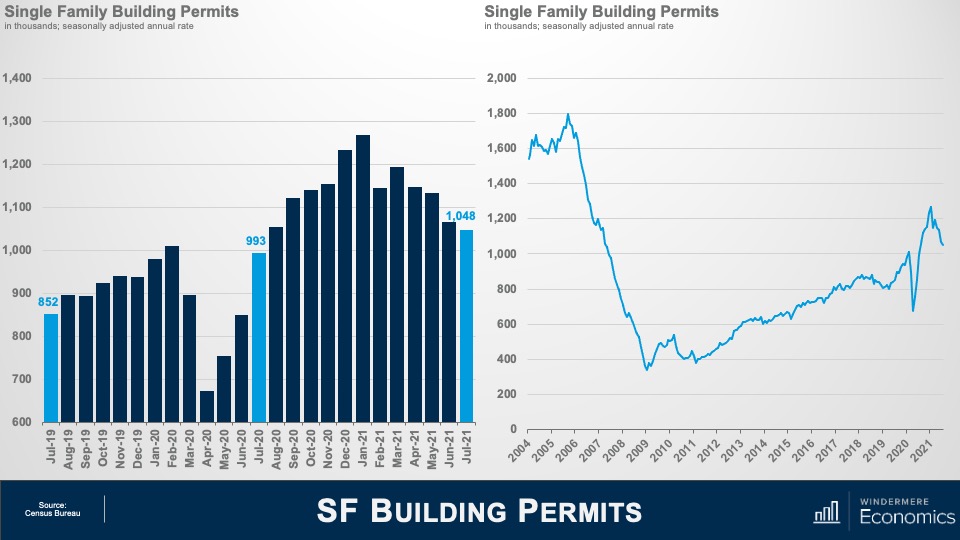
New home permits – and here I am referring to single-family permits – fell by 1.7% (or roughly 18,000 units) in July to an annualized rate of 1.048 million units and have been heading backwards since March.
But I always like to put things into perspective and you can see here that although we have seen a pullback over the past few months, the trend has actually been heading higher since we emerged from the financial crisis in 2011.Of course, COVID had a very pronounced impact on permit activity, but it bounced back rather impressively, that is until the parabolic increase in lumber and other costs really started to hit builders hard.

And the slowdown in permits obviously impacted housing starts which dropped by 4.5% – or 52,000 units – to an annual rate of 1.11 million.
Starts fell across most regions, with the exception of the west which rose by 0.9%. Declines were led by the Northeast (-6.3%), followed by the Midwest (-2.3%) and the South (-2.0%).
But again, for perspective, you can see that the longer term trend is still improving, but I am afraid not to the degree needed to address the massive housing shortage that the country faces.
If you have watched these videos for any length of time you will know that I like to look at homes under construction as opposed to housing starts – which many do not – as I believe it offers a better gauge of the market that permits or starts data. And for those who might not be aware of the difference between housing starts and houses under construction, a home is technically started if a foundation has been poured, but it does not mean that vertical construction has started, but homes under construction show just that.
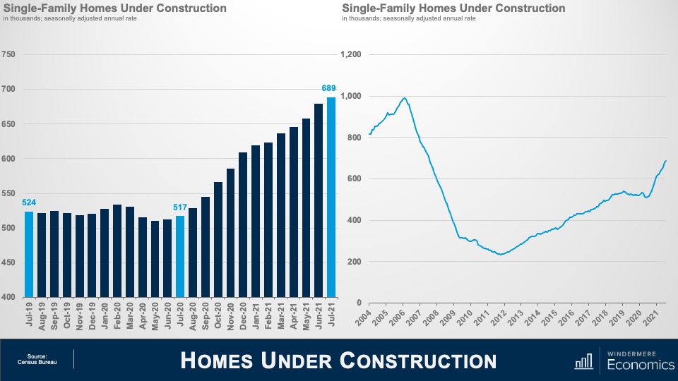
And the number of homes actually being built rose by 1.5% in July to an annual rate of 689,000 units, and that is 33% higher than the same time a year ago.
All regions other than the Northeast – which dropped by 1.6% – saw the pace of vertical construction rise versus June with the South leading the way with a 2.7% increase. This was followed by the Midwest which rose by 1.1%, and the West saw a more modest increase of 0.5%.
Again, when we look at a longer timelines, the growth is actually rather impressive, but, again, it still falls well short of demand.
So, what I see in this data is that the pullback in housing starts was not a surprise, given that permitting activity (which is a leading indicator for starts) having fallen in each of the prior three months. But despite this, the overall pace of new homebuilding actually remains relatively healthy, with the six-month moving average of homes under construction above the pre-pandemic trend at a little more than 655,000 units.
Although rising material costs, a significant shortage of qualified labor, and affordability challenges are all still keeping builders awake at night, I believe that the fundamentals for homebuilding remain solid, thanks mostly to an improving labor market backdrop and still exceptionally low inventory levels.
Additionally, a recent easing in mortgage rates, and a significant pullback in lumber prices which have fallen sharply since peaking in mid-May and are now back to pre-pandemic levels, also provide support to growing new construction activity.
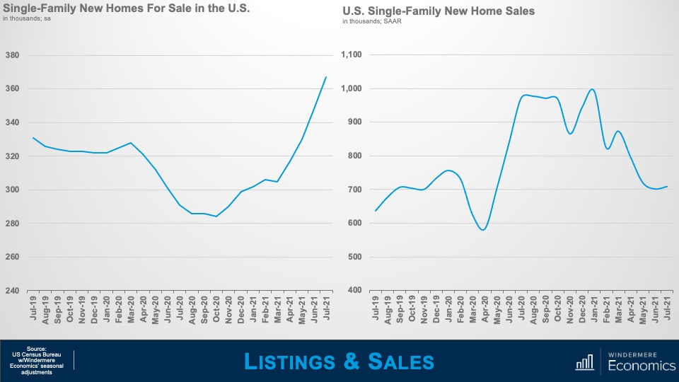
Moving on to new home sales in July and it was a bit of a mixed bag. As you can see here, the number of new homes for sale continues its upward trend – which bottomed out last Fall – and rose by 5.5% versus June and is up by over 26% from a year ago.
Now, this may sound to be great news but as I dug though the data, I saw a different story. You see, the jump in listings was driven by a record rise in homes for sale that have yet to be built.
In fact, the number of houses for sale that have yet to break ground accounted for almost 29% of total inventory. Why is this? It’s because many builders are very cautious about the market given expensive raw materials as well as limited land supply and construction workers.

On the sales side of the equation, contract signings were up by 1% versus June to a seasonally adjusted annual rate of 708,000, but that is down by 27% from a year ago.
Last month’s gain in new home sales was driven by a 1.3% rise in the populous South and a 14.4% jump in the West, but sales plunged 24.1% in the Northeast and were 20.2% lower in the Midwest.
There can be no doubt that affordability is becoming an increasing issue in the new-home market. The median sale price is up almost 18% from its pre-pandemic level, which is a touch lower than the run-up in sales prices in the existing-home market, but still enough to deter potential homebuyers.
And cost is another factor – in addition to COVID-19 – that is accelerating the migration to suburban markets and metro areas in lower-cost states such as Arizona, Utah, Texas and Florida. But, by contrast, new home sales have weakened in areas where population growth has slowed, in part due to an outflow of residents seeking more affordable real estate, lower taxes and other lifestyle advantages. It will be very interesting to see if this is a trend that continues as we head into 2022.
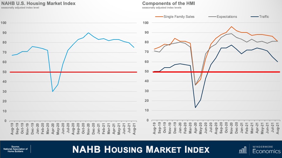
Moving on – the National Association of Homebuilders published their Index of Builder Sentiment in August, and the data rather echoes the numbers that we have just been discussing. You can see that sentiment in the single-family market has been easing gradually in recent months, but it remains well above the 50 level, suggesting that more builders are seeing the market as good, rather than bad, even if the current index is at its lowest level in 13 months.
And when we look at the components of the index, sales conditions fell five points to 81 and the component measuring traffic of prospective buyers also posted a five-point decline to 60. But the gauge charting sales expectations in the next six months held steady at 81.
As we have talked about, builders are facing significant obstacles and this is impacting the pace of new development. According to Freddie Mac, the U.S. housing market is 3.8 million single-family homes short of what is needed to meet the country’s demand and in order to catch up, builders would need to construct between 1.1 million and 1.2 million single-family homes a year to meet long-term demand but, in truth, the start rate would need to be even higher to shrink the existing deficit that we are currently experiencing.
And with more demand than new supply, what happens? That’s right, buyers turn their attentions to the existing home market and that is a neat segue into the final dataset that dropped this month, and that’s the existing home sales numbers for July.
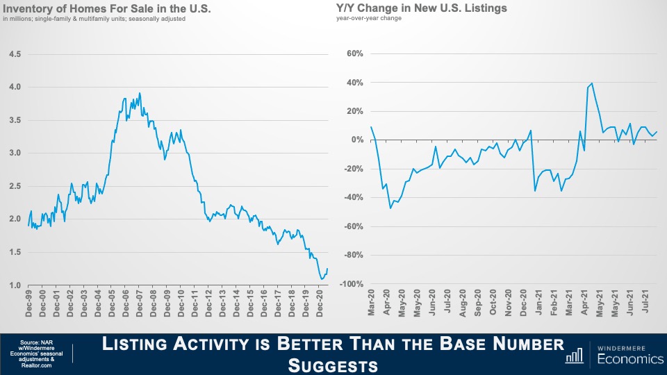
It was pleasing to see that, for the 5th month in a row, Inventory levels ticked higher and, unadjusted for seasonality, were measured at 1.32M units, but I like to look at the seasonally adjusted number and that came in at a still respectable 1.0246M units.
I also like to look at the number of new listings which gives a better view on the market – and as you can see here, they are up year-over-year and that is allowing sales to accelerate.
You see, the inventory number that NAR puts out represents the number of homes for sale at a set date in the month; however, new listings show the total number of homes that came on the market during that month and if a sale is agreed upon in the same month that it comes to market, then it is not included in the overall inventory number.
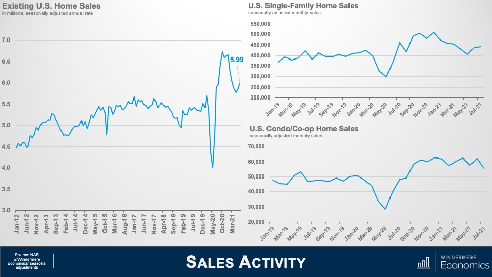
And because new listing activity is still pretty robust, it has allowed sales to tick back up as you can see here. On a seasonally adjusted, annualized basis, sales came in at 5.99M – up for the second month in a row but still well below the numbers we saw last Fall.
On a month-over-month basis, single-family home sales rose by 1% to almost 442,000, but multifamily sales dropped by over 10%, but were still up by 15% from a year ago.
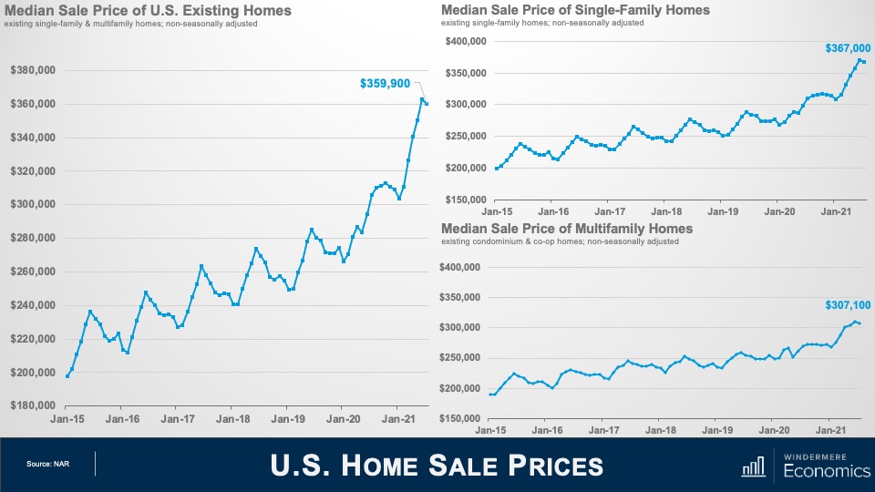
Home prices took a little breather in July – dropping by 0.8% month over month – but are still 17.8% higher than seen a year ago.
Single-family home prices also dipped by 0.8% to $367,000 – but are up by 18.6% from a year ago and multifamily sale prices dropped by 1.3% to $307,100 but were up 14.1% from July of 2020.
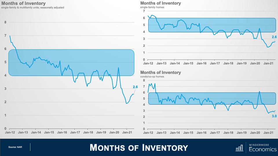
Even though we saw modest increases in listing inventory, the market is still far from balanced. At the existing sale pace, there is only 2.6 months of supply, well below the 4-6 months that is considered balanced, but certainly better than the 1.9 months we saw back in January.
The same was seen in the single-family arena which also showed 2.6 months of supply and things were slightly better in the condo and co-op world where there is currently 3 months of inventory.
As I went through the report in more detail, there were a few more nuggets worthwhile mentioning. Although it is true that inventory levels are somewhat higher – which is certainly a good thing – but the market remains remarkably tight.
For example, for every offer accepted on a home in July, there were 3.5 additional offers; half of all offers made in July were above the list price and, because the market remains highly competitive, the number of all-cash offers rose from 16% a year ago to 23% in July. And with 89% of homes going pending in the same month that they were listed, and the average days on market coming in at just 17, we are still quite far away from experiencing a normal housing market.
Well, I hope that you have found this month’s discussion to be interesting. As always if you have any questions or comments about this topic, please do reach out to me but, in the meantime, stay safe out there and I look forward the visiting with you all again, next month.
Bye now.
")


